
Pantone 2026 Color of the Year: A Trend Signal, Not a Creative Straitjacket
Every year, Pantone’s Color of the Year sparks a familiar ripple through the advertising and marketing world. Decks get updated, mood boards get refreshed, and brands start asking the same question: How do we use this? From an agency perspective, the Pantone 2026 Color of the Year isn’t just a hue—it’s a cultural signal. And like all good signals, it’s informative, influential, and imperfect.
Pantone doesn’t choose a color in a vacuum. The selection is shaped by global events, cultural moods, emerging technologies, sustainability conversations, and shifts in consumer values. That’s why we see the Color of the Year as a useful shorthand for how people are feeling right now. Is the world craving comfort? Optimism? Stability? Rebellion? Color becomes a visual expression of those collective emotions, which makes it a powerful starting point for creative and strategic conversations.
From a marketing standpoint, trends like this help us pressure-test assumptions about consumer behavior. If a color resonates widely, it often aligns with deeper preferences—how people want brands to make them feel, what aesthetics feel “current,” and which emotional tones are cutting through the noise. Used thoughtfully, the Color of the Year can help brands feel timely, culturally fluent, and emotionally relevant. It can inform campaign palettes, product design, experiential spaces, and even brand voice.
At Thinkhouse, we’re always watching cultural cues not to chase them blindly, but to understand the why behind them. That’s what helps us shape forward-thinking campaigns on our services page that feel both relevant and true to a brand’s core identity.
But here’s the part agencies have to say out loud: trends are indicators, not instructions.
The danger comes when trends are treated as rules instead of references. Chasing the Color of the Year simply because it’s popular can dilute brand equity fast.
A color that feels authentic and powerful for a wellness brand might feel forced or confusing for a financial institution. Consumers are remarkably good at sensing when a brand is borrowing relevance instead of earning it.
That’s why we encourage clients to use trends as a lens, not a mandate. Ask why this color resonates now. What emotional need does it reflect? What tension does it respond to? Then filter those insights through your brand’s existing identity, audience expectations, and long-term goals. Sometimes the smartest move is embracing the trend directly. Other times, it’s reacting to it indirectly—or not at all.
This concept shows up in the work we do, whether it’s strategic design updates or bold multimedia campaigns—browse our portfolio to see examples of how cultural signals are interpreted thoughtfully in everything from packaging to digital storytelling.
Trends are also inherently temporary, while brands are built for longevity. Locking yourself into any single moment risks creating work that feels dated as soon as the cultural conversation shifts. The strongest brands use trends to stay aware, not to steer the entire ship.
In 2026, Pantone’s Color of the Year gives us another valuable snapshot of where culture is leaning and how consumers may emotionally respond to visual cues. We love it for inspiration, alignment, and insight. But we love discernment even more.
Because the real win isn’t following the trend—it’s knowing when, how, and if it makes sense for your brand. And if you ever want help navigating the line between trend and timeless, we’d love to talk at thinkhouse.com.
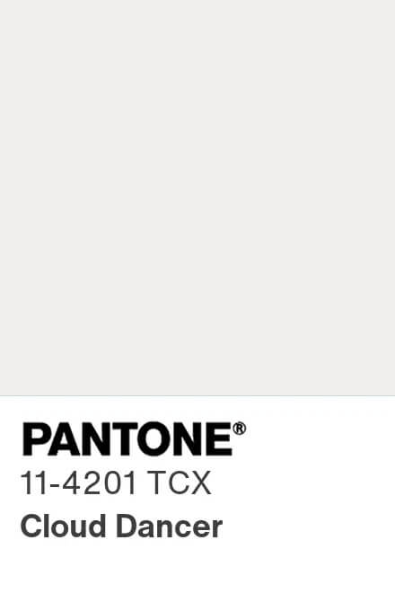
See the Pantone Color of the Year here.
Pantone LLC is a wholly owned subsidiary of X-Rite, Incorporated. © Pantone LLC, 1995 – 2026. All rights reserved. Thinkhouse is not affiliated with Pantone LLC whatsoever.


Questions?
Have a digital marketing question? Looking for some guidance? Send us a message and we'd be more than happy to help.
Sign up!
Join our mailing list for helpful insights.